Monday, May 17, 2010

Week 7: Digital Elevation Models


The area that I selected is in the Los Angeles region. The extent of the area, in decimal degrees is 119.409 W to 118.824 W, and 34.438 N to 34.827 N. The geographic coordinate system is North American Datum 1983 (UTM Zone 11). The region I chose is hilly in its topography, as easily seen by the 3-D models below. By looking at the aspect map, it can be seen that a lot of the land faces north/south rather than east/west. The slope of the hills is relatively gentle, except at the peaks (shown by red areas on the slope map). The hillshade map gives a good picture of the general terrain. I included the 3-D images from two different angles to give a greater picture about what the region generally looks like.

Monday, May 10, 2010

Week 6: Map Projections


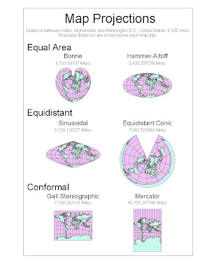
Map projections are necessary because a three dimensional sphere, like Earth, cannot be flawlessly represented on a two dimensional map. When we try to represent the Earth on a flat surface, distortions occur which could be deceiving to the map reader. However, maps are able to preserve certain features, such as direction, distance, or area. This makes particular maps better for specific purposes than others. Three map projection categories that I have included in my ArcGIS project are equal area, equidistant, and conformal. Depending on what the map is being used for, each of these categories could be beneficial. When looking at the distance between two cities, such as between Washington D.C. and Kabul, Afghanistan in my project, different results will be yielded based on the type of projection used. Some projections exaggerate the distance by almost double. This is one example of why map projections matter when doing spatial analysis.


The first two maps on my project are equal area projections. An equal area map is made so that one square kilometer drawn on one portion of the map is equal in area to a square kilometer drawn on another portion. The Bonne projection is a pseudoconical equal area map projection. It has a slight heart shape, and on the central meridian and standard latitudes shapes are not distorted. The other equal area map on my project is the Hammer-Aitoff. Hammer created this equal area map based on Aitoff’s equidistant map. One aspect of the significance of an equal area map is that it does not exaggerate the sizes of continents relative to each other. This could be important because for political purposes, political leaders could choose a map projection which makes their country look gigantic compared to another country, when in reality the countries are close to the same size. It could be used as propaganda to advocate going to war against another country. Thus, the map projection could be purposely used to deceive the viewer. When relative area is an important aspect of a map, an equal area projection is a useful tool.


The next map projections are equidistant, a map that is centered so that any distance from the central given point is an accurate representation of the distance from that point. Distance is not preserved from any point on the map, but only to the one or two control points. One type of map projection that can be classified as equidistant is the Sinusoidal projection. This is equidistant in the respect that the true distance between two points on the same meridian corresponds to the distance on the map between the two parallels. Another equidistant projection is the equidistant conic projection. On this map the meridians are all equidistant, straight lines which converge at a point, and parallels are arcs of circle, in which distortion is constant along the arc. One significant feature of an equidistant map is that you can compare your distance to other places on the Earth, if you were located at a control point on the map. This could be helpful in determining the shortest route to take if you were on an airplane. Equidistant maps in my project were fairly accurate in projecting the distance from Washington D.C. to Kabul, Afghanistan, even though neither city was a control point on the map. The equidistant conic projection gave the most accurate distance between the two cities of any projection featured in my project.


The final map type represented in my projection is conformal. On conformal maps, angles are preserved locally. This means that a small area can be rendered in its true shape. These maps use grids of longitude and latitude. They do not preserve area or distance, but give a good general picture of the Earth. One example is the Gall Stereographic projection. While temperate countries are shown well on this projection, its vertical stretch creates a large amount of distortion at the poles. This would make this map a poor choice for analyzing how much remaining habitat there is for polar bears. Another example is the Mercator projection, which also greatly distorts the size of land near the poles. The significance of this map is that it is useful for nautical purposes due to its ability to preserve local angles. The linear scale is constant in all directions around a point.


The map projection that is most useful for a specific purpose depends on what is trying to be shown by the map. Equal area, equidistant, and conformal map projections are all useful for certain purposes, but can be misleading if used for other purposes due to distortion. In order to determine the utility of a map, we must be able to understand the implications of the distortions. While these distortions may be dismissible on a small scale, when looking at the world as a whole the distortions are magnitudes larger. By looking at the distance between Washington D.C. and Kabul, Afghanistan on each map projection, it is clear that the distortions really do matter.

Tuesday, May 4, 2010

Week 4: GIS Data Models


The ArcGIS tutorial takes the user through many of the features available on the program. While it gives the user the freedom to analyze spatial data, many of the features are not intuitive and the user is therefore limited by the program’s complexity. Yet undoubtedly, the potential of GIS is huge. Because it allows its user to store, edit, and create data, it brings us to a new age of information sharing. The main pitfall of the software that I observe is that it is not easy to use for the untrained geographer.
GIS gives people the ability to create maps without having to perform repetitive work. It stores information such as population density, county borders, and school locations so that each geographer making a map of a particular area does not have to start over and collect information all over again. It gives users the ability to build off information already input into the program, while leaving creative freedom to the individual. As more and more information is acquired, GIS becomes very important. It gives us a way of analyzing this data. Population density is important to analyze when deciding where to place community resources such as hospitals and fire departments. GIS can help us decide how to allocate resources in the most spatially effective way.
Another great area of potential in GIS is that we are able to see relationships and correlations by plotting data on the same map. This is applicable to many fields and careers. An example is compiling a map to judge environmental justice in a region. This may consist of a map layered with pollution information and with the race of people living in the region. This type of spatial analysis allows us to determine when environmental injustice is occurring, giving us the possibility to better address it. It would obviously be best if no one had to live in pollution, but unfortunately there is not so much environmental equity in reality. Certain neighborhoods bear the brunt of our pollution, and it is only by comparing these areas spatially to other areas that we can pinpoint these problems. GIS therefore gives us greater understanding of spatial relations so we can make sensible decisions.
However, GIS does have its pitfalls. Unlike neogeography, GIS is map-centric. Neogeography is friendly to the user, and the average person is able to easily create and use maps in new ways. GIS, on the other hand, requires training. While the tools desired by the user may be available through the program, if the user is unable to access these features then it is useless. GIS also has the potential to make the user think they are seeing the “whole picture” when looking at a region, when in reality key information may be missing. An example is that if an elementary school was placed in a region because the population density was relatively high but there was an absence of schools in the area, the school may not be needed because the majority of the population in the region may be past retirement age. Therefore, a flaw in GIS is that it may seem to be representing all the important features of a region, but in reality could be excluding very important data.
When going through the tutorial for the 4th or 5th time, I felt like I was getting a firm grasp on the program ArcGIS. I am comfortable with the main tools and feel that I would be able to do spatial analysis regarding any of the features in the tutorial. However, I do feel that I am limited in my knowledge to what was included in the tutorial. If I had to do spatial analysis in a rural area, I might not be prepared. When something went wrong in the tutorial and I couldn’t click “Undo”, I had no way of troubleshooting the error. The problem comes down to this fact: Using GIS is a skill that must be learned and practiced to be effective. The tutorial is easy to follow and is a great algorithm for making the specified map, but even after thoroughly reviewing the tutorial, the user has barely even tapped the surface of the capabilities of the program. So, while GIS has clear potential to make astonishing leaps in information technology, the pitfall is that its success is limited by the number of people who can use it.

Monday, April 19, 2010

Week 3: Neogeography

Be In the Audience!

Attending tapings of TV shows is an entertaining, inexpensive way to spend your day without much planning, especially if you live near a major city. This map lays out TV shows that use live studio audiences when they tape. These shows are all free to attend so the only cost to you is transportation. Ticket reservations for most shows can usually be made online.

Use this map to find show tapings near you, or near a place you will be visiting!

Click a flag on the map to find which TV show is taped there, a brief description of the show, the link to request tickets, and a video clip to give you an idea of whether or not this show would be interesting to you.

It is recommended that you open this map in a larger window using the link under the embedded map for user convenience.


View Be in the Audience! in a larger map.

Notes About the Map:

Destinations on the map are placed based on the address of the studio where the show is filmed. While the link to get tickets for all shows is shown, tickets are not available year-round for all shows, and some shows tickets are given out based on a lottery system. Video clips are shown for all shows except Saturday Night Live because video clips from SNL are usually taken down almost immediately due to copyright infringement, so there is a still image in place of a video.

Commentary:

Neogeography opens up a world of potential when it comes to information sharing and spatial thinking. With easy-to-use technology like My Maps on Google Maps, virtually anyone can create mashups and display information in a spatial way. With billions of people in the word and increased availability of internet access, there is an abundance of custom maps that range from useful to entertaining to bazaar. With this abundance in information comes the potential for great leaps in technology and progression as a society. Neogeography allows users to interact with the world around them in new ways. One way that these maps have the potential to help people is through interactives maps such as the one found at http://www.meganslaw.ca.gov/. This map plots sex offenders in California so that anyone can pull up the map and see where sex offenders live in their neighborhood. While this is not desirable for the sex offenders themselves, especially if they are trying to move on from a mistake in the past, or to a person trying to sell a house that happens to be located next door to an offender, it does give useful information to families living in an area with many registered sex offenders. These families may want to take extra precautions to protect their children. It allows parents to recognize individuals that live nearby that have committed atrocious acts, so that they can better protect themselves and their families. If having this information available prevents even one horrible act from occurring, then it would be difficult to argue that this information availability doesn’t have positive consequences.

While neogeography is revolutionary in terms of the organizing and displaying information, the question arises, as it does with every breakthrough in information technologies, can this be a bad thing? It could be certainly argued that neogeography has dangerous pitfalls. For the same reasons that neogeography is good, such as that it allows data to be viewed spatially by users, it could also have undesirable consequences. One example of this is the mashup found at www.eightmaps.com, which is a mashup of Google Maps and Prop 8 Donors. This map shows the locations, names, occupations, and amounts donated of people who donated to pass Proposition 8, a highly controversial proposition on California’s ballot in November 2008 that banned same sex marriage in the state. This map is a user-friendly way for anyone to see which people in their town, or even street, donated to help pass Proposition 8. This subjects the donors to consequences such as vandalism or violence from those whose lives affected by the proposition passing. Another pitfall of neogeography is that the information on the maps may not be accurate. Unless the maps are from a credible source, their utility is limited by their reliability. Neogeography opens up new possibilities, some good and some bad, that can and will change the way we think about the world.

Tuesday, April 6, 2010

Week 2: USGS Topographic Maps

Lab 2:

1) The quadrangle is called the Beverly Hills Quadrangle (Located in Los Angeles County, CA).

2)

NW: Canoga Park
N: Van Nuys
NE: Burbank
W: Topanga
E: Hollywood
S: VeniceSE: Inglewood

3) 1966
4) North American Datum of 1927 and North American Datum of 1983 were used to create the map.

5) The scale is 1:24,000.

6)

a. [1/24,000] = [5 cm/d) d= 120,000 cm
[120,000 cm] x [1 m/100 cm] = 1,200 m

b. [1/24,000] = [5 in/d]
d= 120,000 in
[120,000 in] x [1 ft/12 in] x [1 mile/5,280 ft] = 1.8939 miles


c. [1/24,000] = [d/1 mile]
[1/24,000] miles x [5280 ft/1 mile] x [12 in/1 ft] = 2.64 in

d. [1/24,000] = [d/3 km]
d= .000125 km
[.000125 km] x [1000 m/1 km] x [100 cm/1 m] = 12.5 cm


7) 20 feet

8)
a. 34*04'26'' N, 118*26'21'' W or 34.074*N, 118.439*W

b. 34*00'27'' N, 118*29'58'' W or 34.008*N, 118.499*W

c. 34*07'13'' N, 118*24'36'' W or 34.120*N, 118.41*W

9)
a. 580 ft or 176.78 m
b. 140 ft or 42.672 m
c. About 650 ft or 198.120 m

10) Zone 11

11) 3,763,000 m N, 361,500 m E

12) 1 square kilometer

13)


14) The magnetic declination is 14 degrees (or 249 Mils) East.

15) The water flows south because the elevation is higher at the most northern part of the map and decreases as the stream goes south.

16)

UCLA


Tuesday, March 30, 2010

Week 1: Spatial Thinking

Map 1: Distribution of the Delta Smelt

Source:

This map is from the UC Davis Information Center for the Environment.

Distribution maps of fish found at:
http://ice.ucdavis.edu/aquadiv/fishcovs/fishmaps.html
Specific map found at:http://ice.ucdavis.edu/aquadiv/fishcovs/dsm.gif


Description:

This thematic map shows the distribution of the delta smelt, a native fish to California that is currently endangered.

The different shades of blue represent that different confidence levels that the area is in the fish's range, denoted by "probable" and "possible".
Present, not historical, range for the species is shown on the map.


Discussion:

This map is very relevant to biogeographers because determining an endangered species' habitat is a critical step in determining which areas need to be protected, which is often a deciding factor in whether the species will go extinct.

This map shows that the fish's range is relatively small, even if the fish actually is distributed through the "possible" area. This map would be important in assessing the consequence that adding a new dam would have on the fish, because if the fish's habitat is destroyed it is likely the fish will go extinct. This map then would be useful in land use planning.

Map 2: Eight Maps

Source:

This map is from http://www.eightmaps.com.
It is a mash-up of Google Maps and information on donors who supported Proposition 8.
The information about who and what amount was donated was obtained from the government website of California Secretary of State Debra Bowen. The website for this information is: http://cal-access.ss.ca.gov/Campaign/Measures/Detail.aspx?id=1302602&session=2007.


Description:

This is an dynamic map which allows the user to see on a variety of scales the locations of the people who donated to help pass Proposition 8. The red flags indicate the address that a donation was made from, and clicking the red flag gives information on the donor's name, occupation, and the amount and date of their donation.

The caption on the website says, "Proposition 8 changed the California state constitution to prohibit same-sex marriage. These are the people who donated in order to pass it."

Discussion:

This map has a lot of power, because the information on it is a sensitive topic. Proposition 8 passed in November 2008, banning same sex marriage in the state of California. This effects a relatively large group of people in California, and if those people decide to lash out against those that contributed to the proposition passing, they have the people's names and locations laid out for them on a map.

This makes it easier for those angry at the donors to find them and potentially do harm, so putting this information on a map gives it more user accessibility, and therefore more power. By mashing together Google maps and the donor information, people can see who in their own region, neighborhood, and even street donated in favor of a controversial proposition.

Map 3: Historic Earthquakes in Southern California
Source:

This map is from http://www.data.scec.org/clickmap.html.

This is the Southern California Earthquake Data Center website, which aims to provide easily-accessible, organized earthquake data.


Description:

This is a thematic map that shows earthquakes of magnitude 4.5 or greater in southern California. Because it is a historic map, it shows the epicenters of historic earthquakes back to 1812.


Major highways and faults are also shown on the map. The size and color of the dot on the epicenter shows the magnitude of the quake that occurred in that location.

Discussion:

This map is useful because plotting the locations of major earthquakes over a map of southern California allows us to see where previous earthquakes have concentrated, which gives us some insight into where earthquakes will likely occur in the future.

It gives us the ability to spatially analyze where earthquakes cluster, which typically is near faults. This helps us to better understand fault boundaries and can influence legislation, such as building codes.